Chart

Written by Stansberry Research
Updated at April 12th, 2024
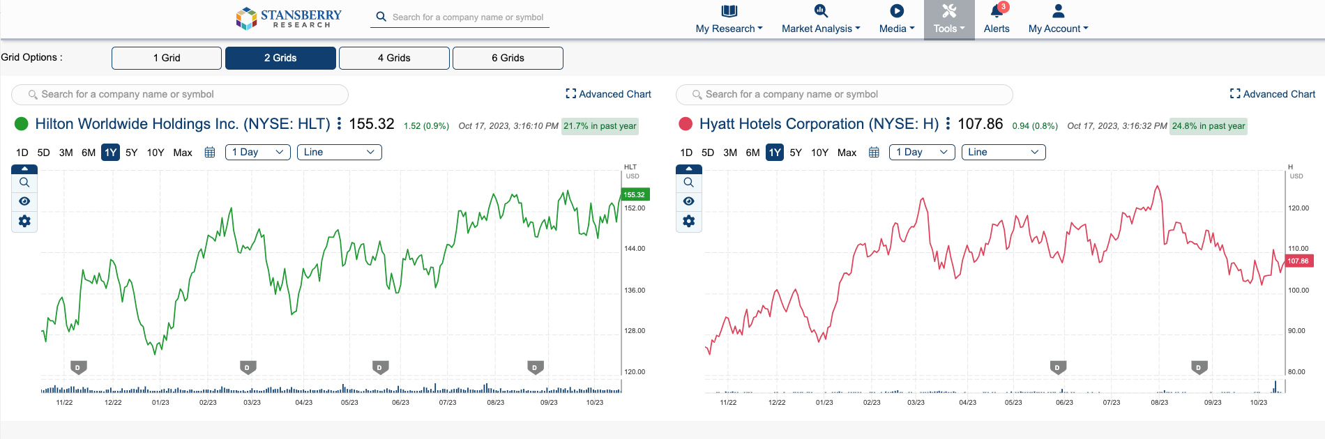
Our Chart feature allows you to view detailed data on specific stocks, macroeconomic data, cryptos, and more. From the Tools page, we offer a multi-chart tool, which lets you have up to six different charts on one page. Each of these charts can represent separate equities or you can enter into the Advanced Chart by clicking “Advanced Chart” in the upper right-hand corner.
The “Advanced Chart” setting is available currently on all charts within the platform. Our Charts support the following: Indicators, Data Overlays, Company Compare, Templates, and more. Each of these can be added to your chart. Read below to learn how to use these features.
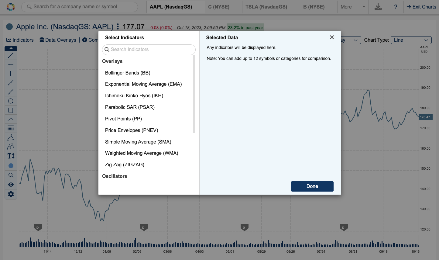
To add an Indicator to your chart, simply click on the “Indicators” button on the top left of the chart. Each of these indicators has a brief description available in our Chart Help Center, signified by the question mark in the navigation bar of the Advanced Chart. Some of our indicators you can simply click and they will be added to the chart, while others such as Exponential Moving Average (EMA), require your input. If you click on EMA, you can choose from our predefined periods or enter a custom period. Once entered, click “Add,” and you’ll see your indicator plotted against the chart. Indicators are displayed with a solid colored line (depending on the indicator type). If you’d like to remove the indicator, simply click the X in the pill or open the Indicators pop-up and remove it from the “Selected Data” portion of the modal. Additionally, like our other overlays and line charts, you can update the color of the line by clicking the color within the pill and choosing from the selection available.
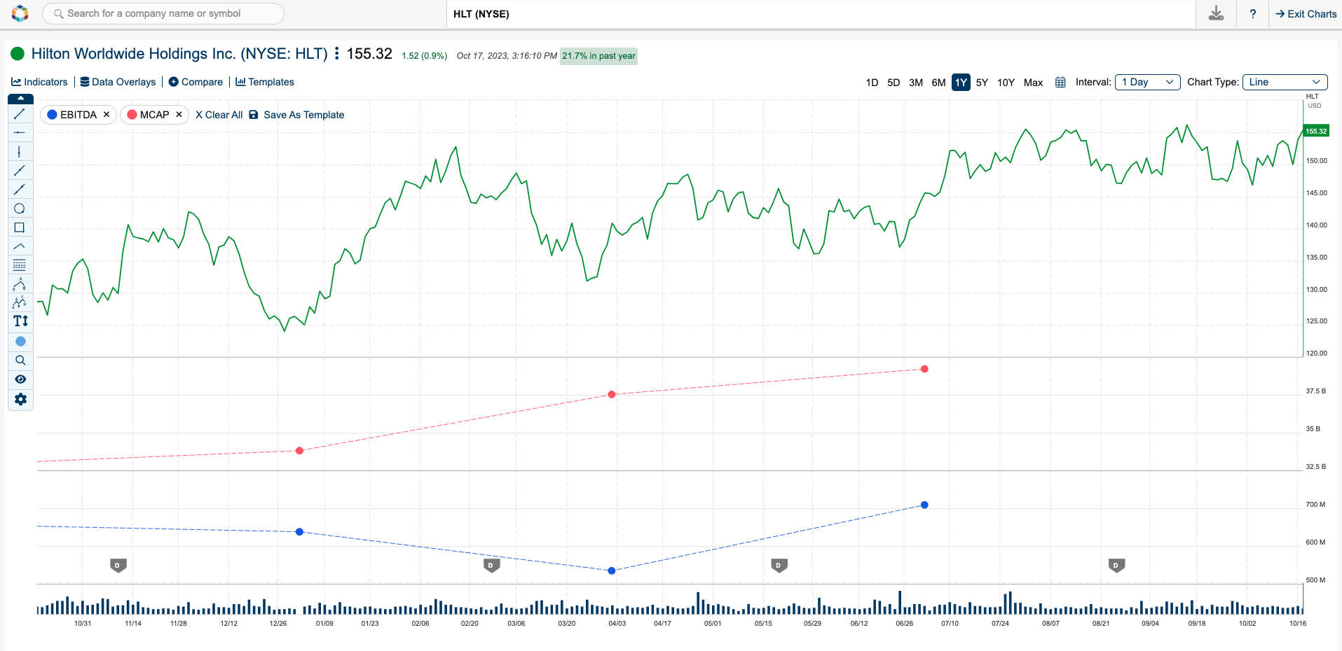
Our charting tool also supports Data Overlays, which were hand-picked by our Investment Committee at Stansberry Research. To add a Data Overlay, click on the title “Data Overlays” and choose from the dropdown menu below. Once you’ve selected your desired overlay, the chart will update and plot the overlay with a dotted line. The Data Overlays use a dotted line to differentiate itself from other Indicators. Much like the other indicators or comparisons, you can edit the color by clicking the colored dot in the pill and choosing a color from those available. To remove this overlay, simply click the X in the pill or go to the dropdown and click on the overlay that is currently displayed.
Between our Indicators and Data Overlays (as well as company comparisons), you can add up to 12 overlays to your chart. As you continue to add overlays, you will see a note in the modal letting you know how many additional company comparisons, data overlays, or indicators you can add.
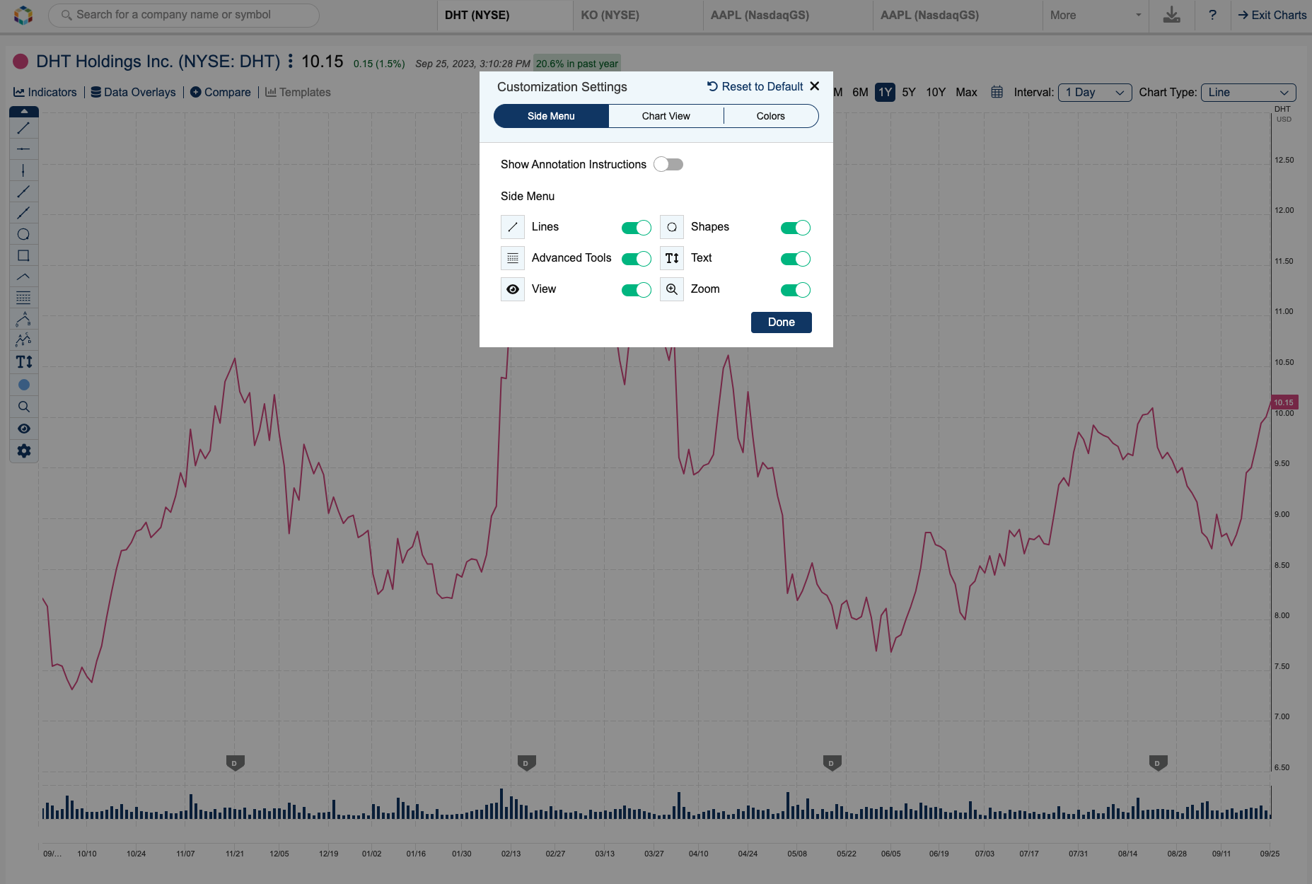
We support a Help Center within each Advanced Chart. Additionally, within our Charts, if you want to update your toolbar, you can easily click the settings wheel. This settings wheel offers numerous options for your own customization, ranging from minimizing options to updating the colors of OHLC and Candlestick charts for improved accessibility. The settings wheel allows you to edit your toolbar, meaning you can remove items from the left-hand toolbar or enable them if they are not currently enabled.
An additional feature that is set by default to all of our charts is Stansberry Research Flags and Dividend Flags. These can be removed by clicking on the "eye" icon in the left-hand toolbar. The Stansberry Flags represent times when one of our Stansberry Research Editors has recommended the equity you're charting. A blue flag represents a recommendation, whereas a gold or orange flag represents a Top Research article. Top Research is a distinction that our Investment Committee flags for articles that we think are some of our best work - and these also feature a recommendation for that particular equity.
One final feature that we offer is chart annotations. Please note: chart annotations are only available as "Advanced Tools" within the Advanced Chart. Our Advanced Charts currently support five different line types, three shapes, and Fibonacci. You can learn more about using these annotations by hovering over the icon, which will provide detailed instructions as to how to use the tool. Additionally, we've recently added the ability to edit the color of your annotations. To change the color, click on the color icon on the toolbar before drawing your line or shape. This will allow you to differentiate between the various annotations you make on your chart, should you choose to do so.